Intro
Men are frequently recognized for a variety of taboos that they feel compromise their manhood. This involves discussing good hygiene practices. Although it may seem odd to discuss this in 2024, some guys are still not extremely committed to it. Balls developed Archibald, their intimate depilator, to help men break these bad behaviors.
Project Goals
Client issues:
• Despite the excellent quality of the product, they were experiencing issues with client conversion for their "hero section".
• In addition to the navigation bar, the page's inadequate design decreased the initial impression of the product's quality.
Therefore, keeping this issue in mind, we must recommend a redesign for the mobile drawer menu and the hero section.
What Methodologies Are Used?
The client gave itself a concise window of time to find a solution. I ultimately resolved the issue by utilizing Nielsen's concepts and heuristics in addition to design techniques, as I could not implement the whole design thinking process.
I'll show how I conducted the solution for the two problems:
• #1 The hero section
• #2 The Mobile Drawer Navigation Menu.
#1 The Hero Section
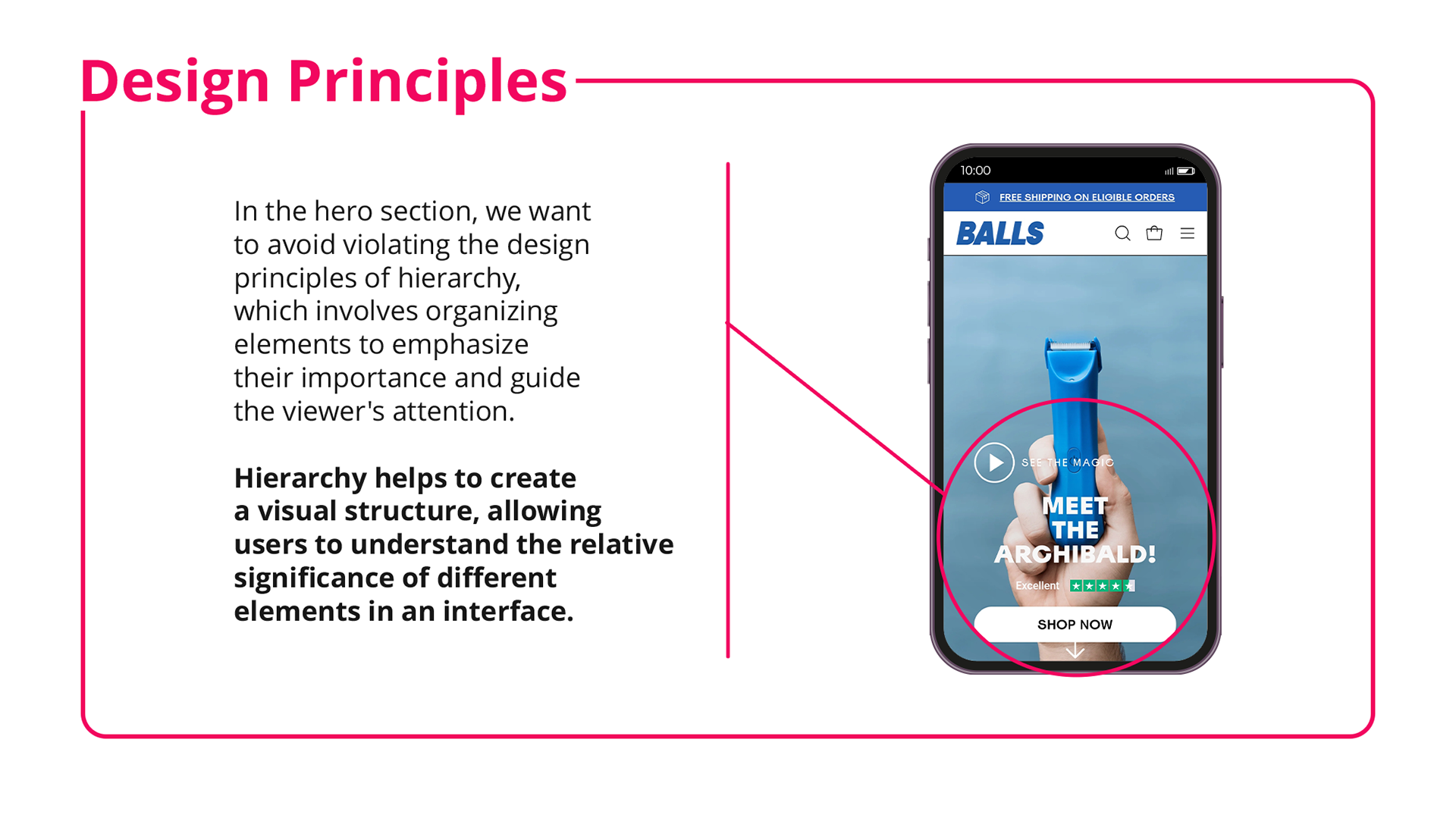
I'll start by outlining the steps involved in creating the hero section. As soon as we examine the hero page, we find information structure issues that hinder the product's initial impression and readability. As depicted in the figure that follows:
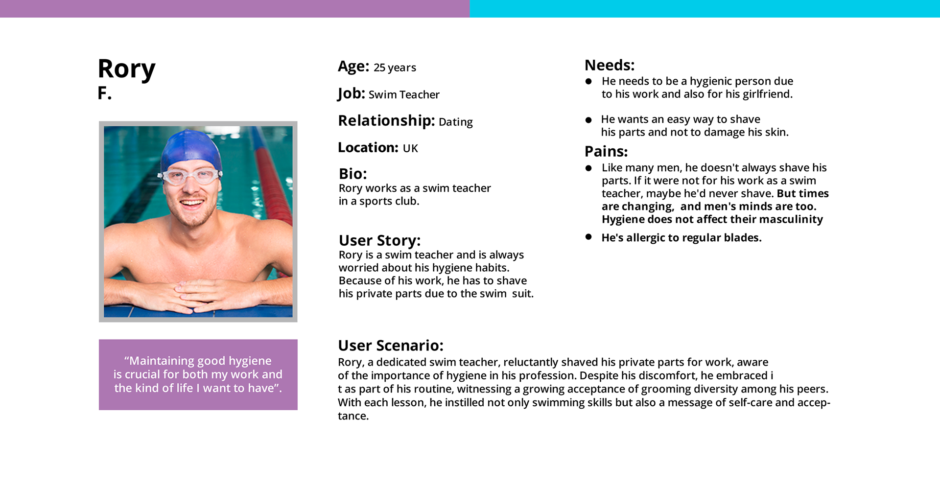
Proto Persona and Customer Journey
I synthesized my observations to create a prototype persona using the information I gathered from the Balls homepage. The company's homepage and email service may contain numerous client endorsements. Maintaining a tight relationship with the target audience, primarily guys who practice good hygiene, is made easier with this proto-persona.
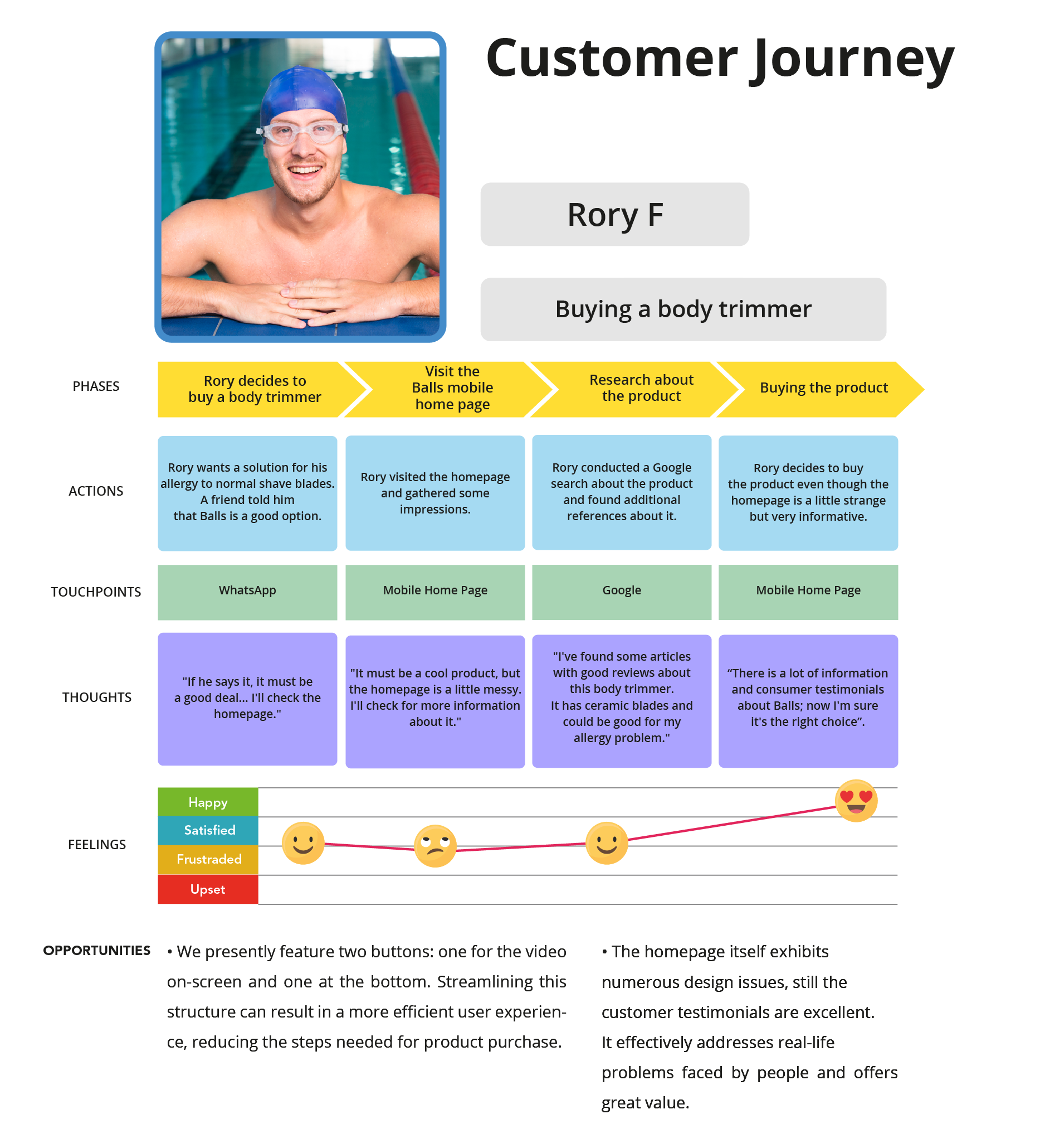
I developed a succinct customer journey for this topic based on a proto persona, however it seemed unclear because of this character. Reducing steps for a more efficient product purchase can improve the customer journey by simplifying just two buttons—one for the on-screen movie and the other at the bottom. Strong customer testimonials demonstrate the product's efficiency in addressing genuine problems and providing outstanding value, even despite the design flaws.
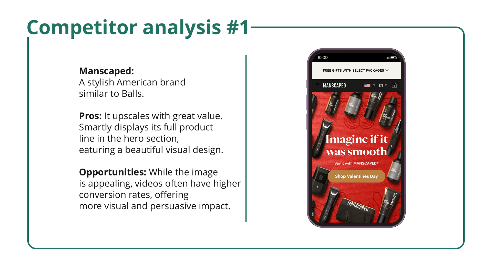
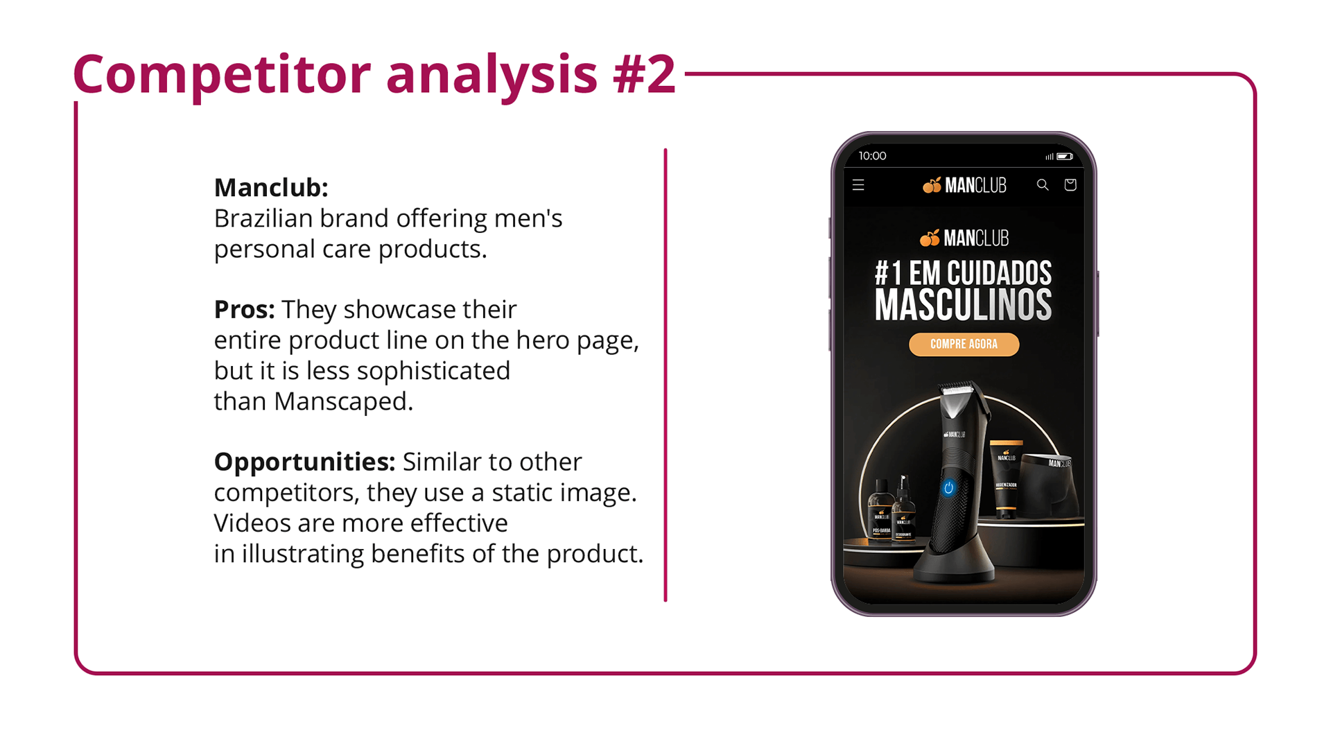
Benchmark Hero Section:
I reached an option to perform a benchmark by examining the "hero section" of two direct competitors to gather more insightful data. I considered the strategy these competitors use for their goods because it is a very unique niche market.
Wireframe
With the data from the discovery stage, I organized the info in a wireframe
to evaluate the interface.
to evaluate the interface.
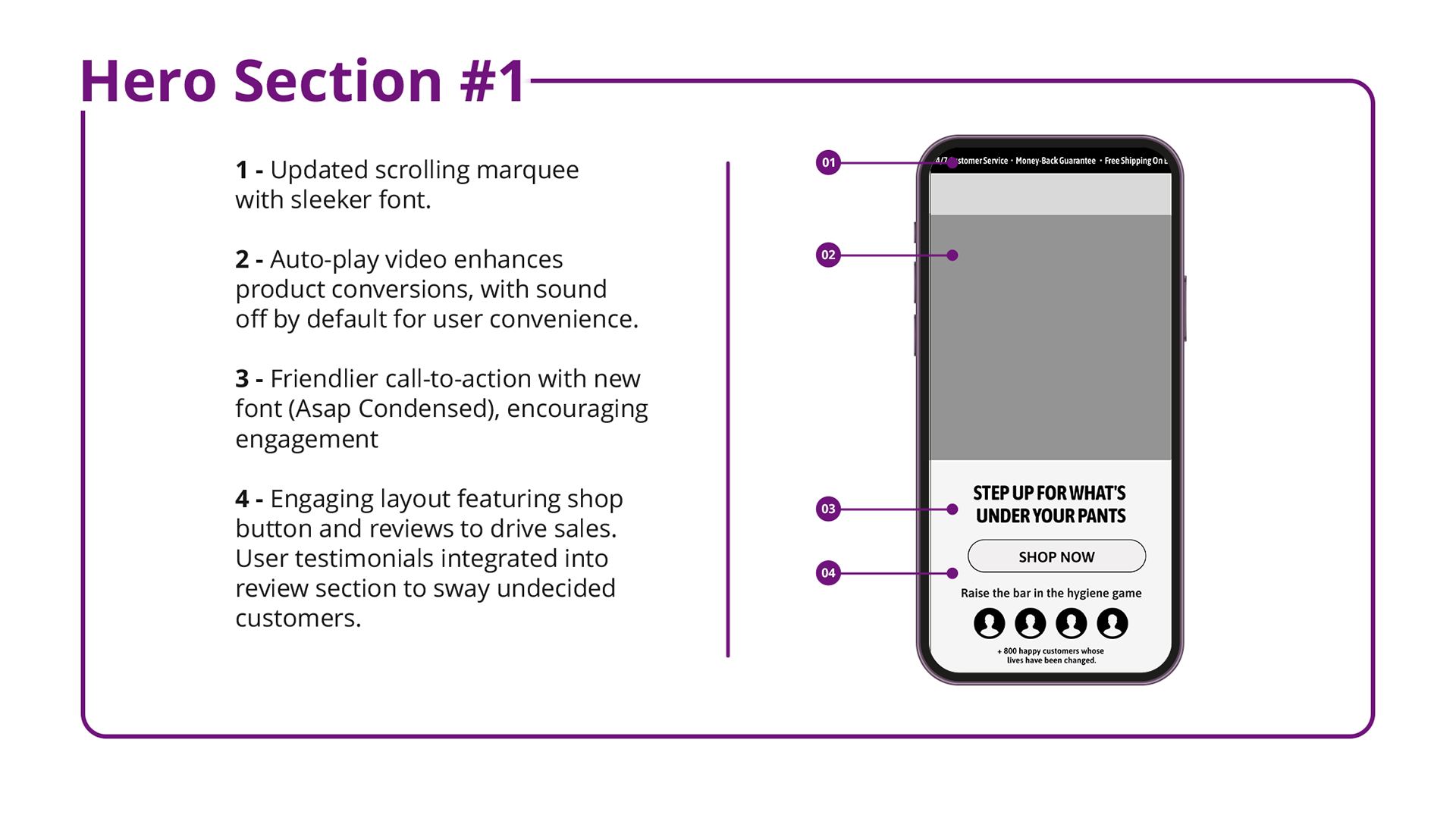
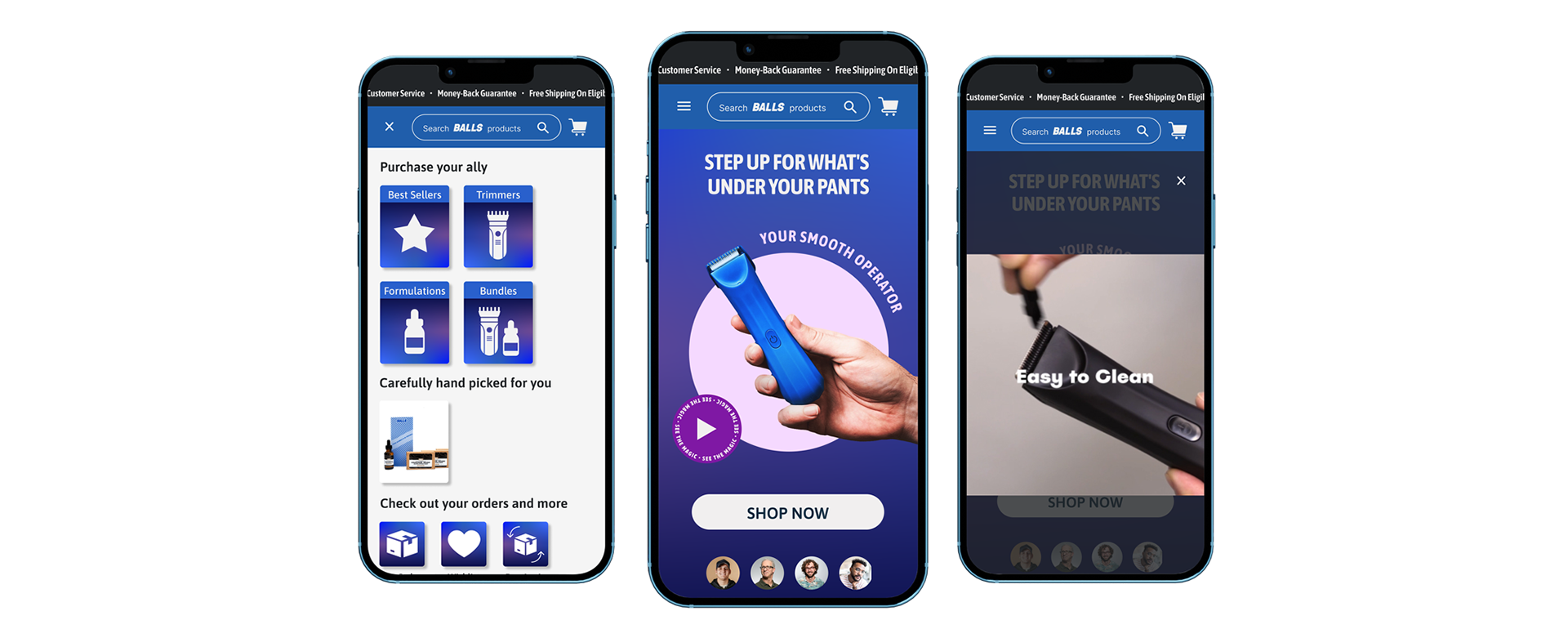
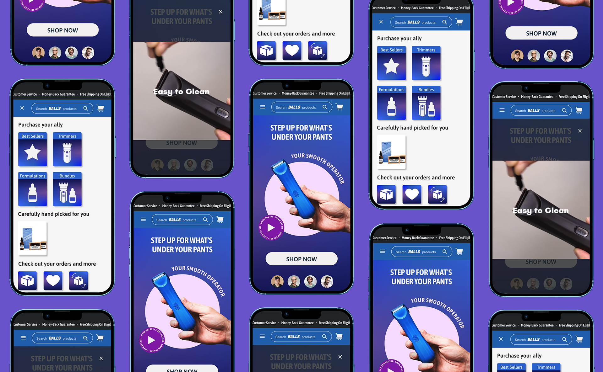
The Hero Page Redesign
Here is the user interface for the mobile hero section for Balls. I used the screen size 360x800px, the most commonly used mobile screen size in the last year. We can see the stats in this link here. With the right hierarchy, font style, and sizes, the mobile section appears more confident to users, encouraging them to purchase the Balls trimmer.
Here, you can see the prototype for the hero page.
Although UX designers occasionally have strong biases regarding their discoveries, we nevertheless need to consider alternative approaches. Here, I created a composition using the product itself to contrast its "fancy" competitors' design compositions with one that is more playful and youthful. If there are any doubts, we can compare the two hero parts in an A/B test to see which has higher customer conversions.
On the side the prototype version.
#2 Mobile Drawer Navigation Menu
Now I'll show you, how I found my solution for the Mobile Drawer Navigation Menu and made it better
for user's experience and conversion.
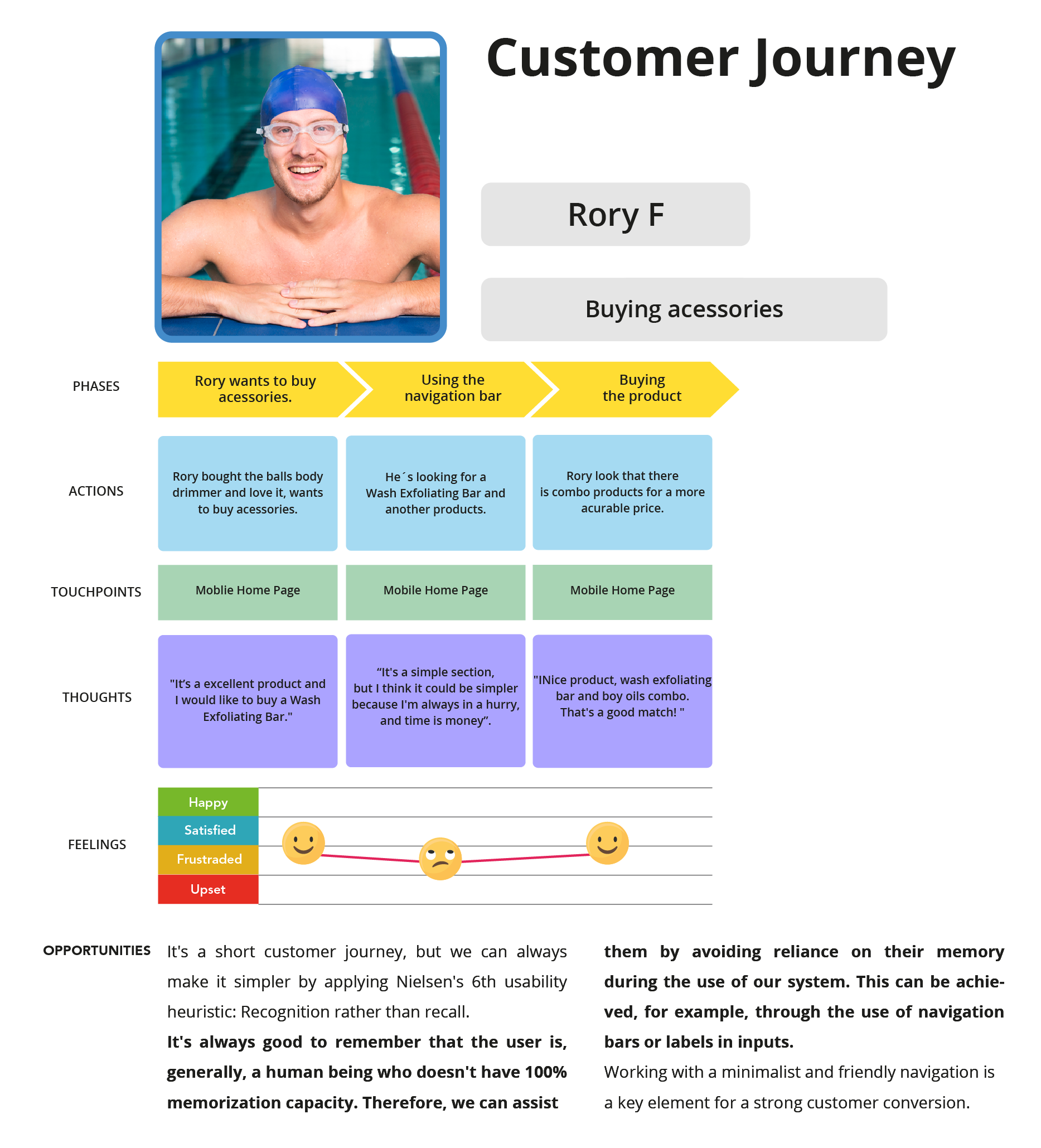
Customer Journey
To take a more assertive approach, I conducted a customer journey with the proto persona Rory F. My input in this journey is that we could make it simpler and more assertive, preventing the user from navigating through multiple sections to find what they're looking for. With fewer clicks, the closer the user gets to purchase what they want.
Benchmark Mobile Drawer:
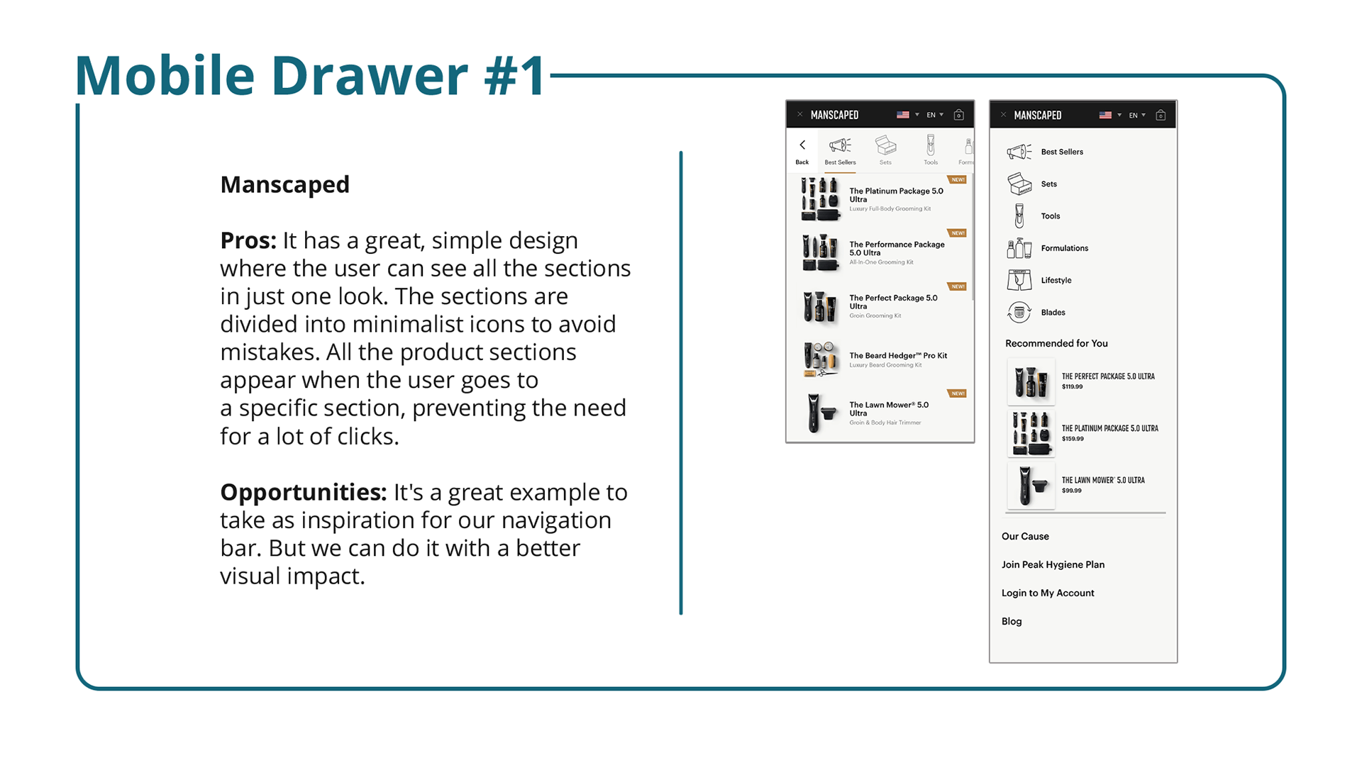
I examined the mobile drawer in the same way that I had the competitor's hero section, taking the best lessons learned and applying them to the client's redesign of the mobile drawer.

Mobile Drawer Redesign
After all these considerations in the research, I chose to create a navigation bar similar to Manscaped. But with the Ball's personality and humor. To organize the wireframe, I made up a sitemap with the sections that the user will choose to navigate. Focusing on the experience of buying products from the hamburger icon.
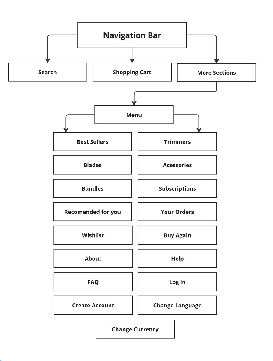
Utilizing my research findings, I crafted a streamlined wireframe for the navigation bar:
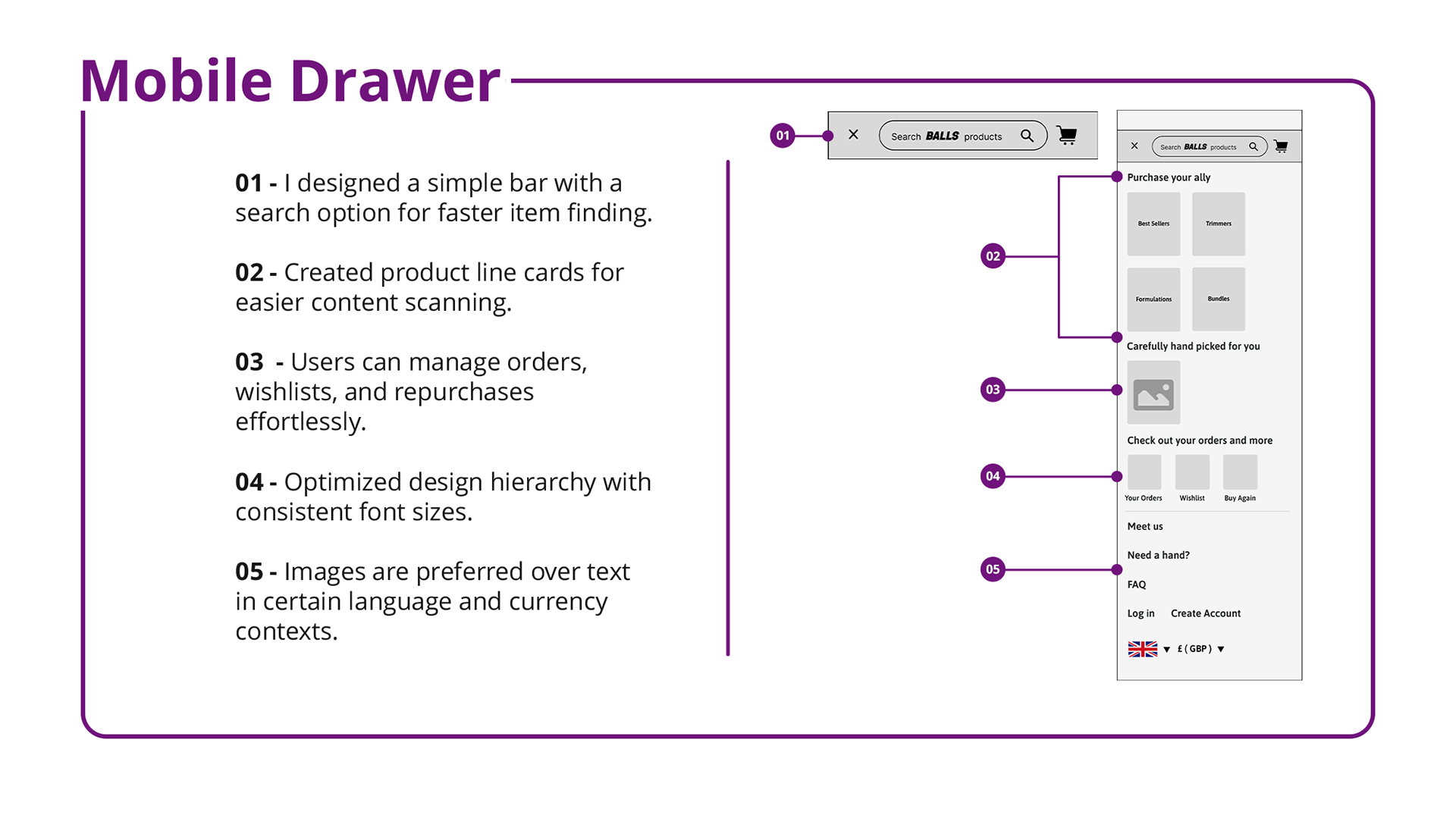
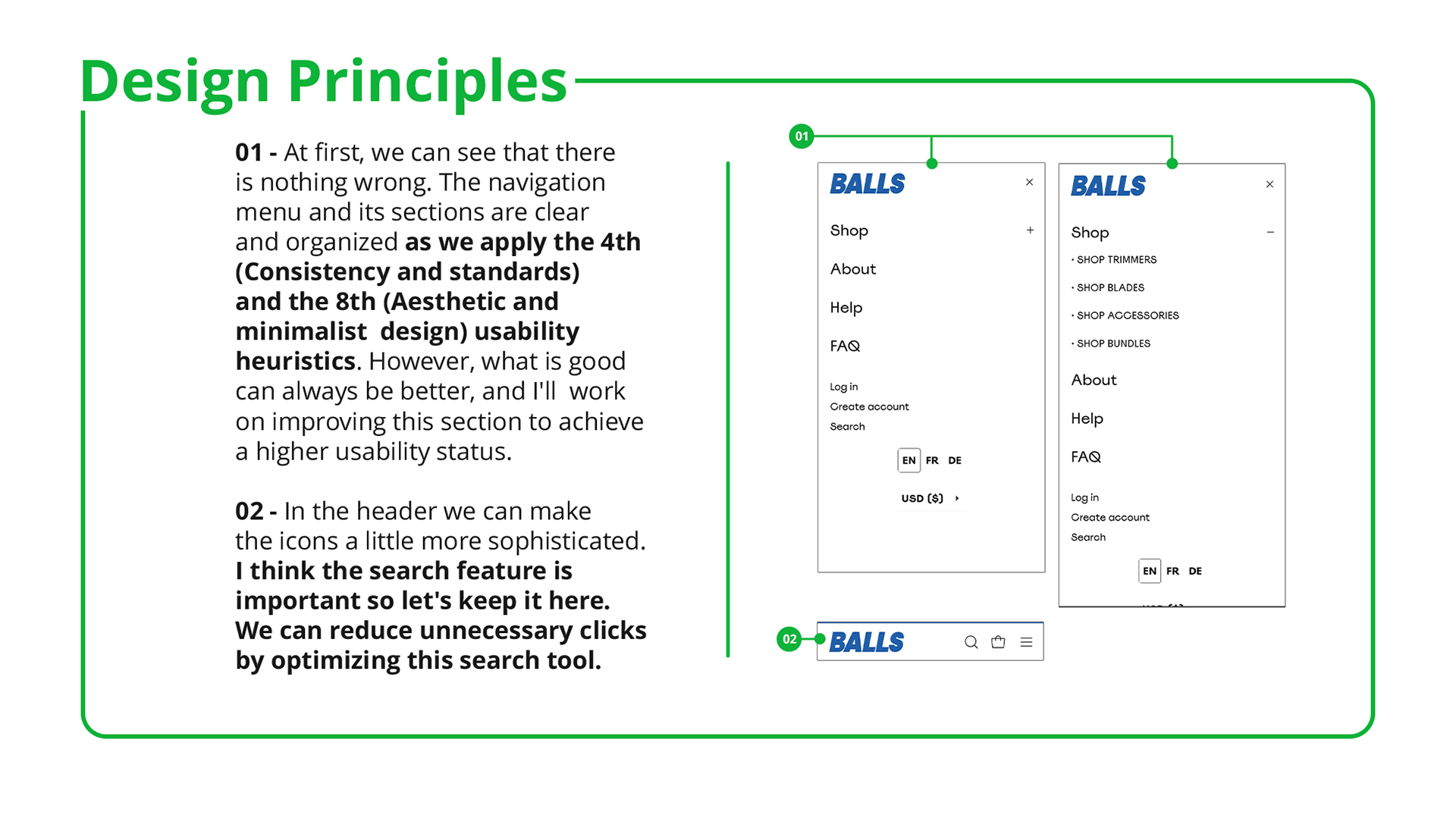
Now, the navigation bar and menu are in high fidelity. With the sections designed in cards featuring products and the use of pictograms, it is easier for the user to scan and find what they are looking for. This aligns with one of Nielsen's most important heuristics: 'Recognition rather than recall.
It's always essential to remember that the user is generally a human being who does not have a 100% memorization capacity. Therefore, we can assist them by avoiding triggering their memory during the use of our system. This can be achieved, for example, by incorporating navigation bars or labels on inputs.
Next Steps
We can conduct user testing with the prototypes and conduct in-depth interviews with a subset of test users to gain fresh perspectives on the various parts thanks to the redesign of the hero page and navigation bar. We can revamp the other sections of the Balls home page with a more defined bias using these data.
Final Thoughts
This study has shown me that males are becoming more conscious of their hygiene practices; it's not just about body image either. Men can live happier lives and prevent many mistakes with this new life philosophy. One healthy habit can improve people's lives.
Thank you for reading my case 🙂